
15 Softball Uniform Ideas: Design & Color Inspiration for Your Team
The hardest part of ordering a custom softball uniform isn’t the ordering — it’s deciding what you want it to look like first. These 15 softball uniform ideas walk through the design directions real teams choose, from classic pinstripe styling to bold color combinations, number treatments, and format-specific looks for fastpitch and slowpitch. Use them as a starting point, then bring the direction you like best to your manufacturer.
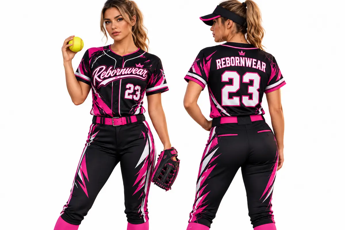
- Style & construction directions — pinstripe, color-block, fade, and more
- Team color combinations that actually work on the field
- Typography and number treatments that stay readable at a distance
- Format-specific looks for youth, fastpitch, and slowpitch teams
Style & Construction Ideas
Direct answer: The style direction is the foundation of the whole uniform — it sets the overall look before color and typography get layered on. These five are the directions softball teams choose most.
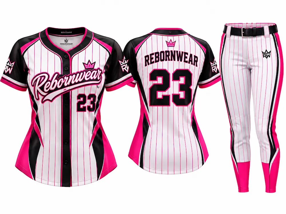
1. Classic Pinstripe
Thin vertical stripes running the length of the jersey and pants — the most traditional look in the sport, borrowed straight from baseball heritage. With full sublimation, pinstripes are printed into the fabric rather than sewn, so they stay crisp and won’t unravel over a season.
Best for: Travel teams wanting an established, traditional identity.2. Color-Block Panels
Bold blocks of contrasting color split across the shoulders, sides, or yoke. Color-blocking reads well from the stands and makes a two- or three-color team palette the centerpiece of the design rather than an accent.
Best for: Rec leagues and school teams wanting a modern, high-visibility look.3. Two-Tone Fade / Gradient
A gradient transition between two team colors, fading across the jersey top to bottom or side to side. Gradients are only practical with sublimation — they can’t be screen-printed cleanly at this scale — which makes them a distinctive, modern choice.
Best for: Competitive fastpitch travel programs wanting a standout look.4. Clean Solid with Accent Piping
A single solid team color with thin contrasting piping along the collar, sleeves, and side seams. The most understated direction here — it lets the logo and lettering do the talking, and it’s the easiest look to keep consistent across jerseys, pants, and warm-ups.
Best for: Programs wanting a timeless, uncluttered team look.5. All-Over Graphic Print
A repeating pattern, camo, or custom graphic covering the full jersey — only possible with edge-to-edge sublimation. The boldest direction on this list, best when a team wants a memorable, one-of-a-kind identity rather than a traditional look.
Best for: Tournament and spirit teams that want maximum impact.Color Combination Ideas
Direct answer: Color is what makes a softball uniform recognizable from the outfield — the right pairing reads clearly at a distance and holds up in bright sun. These are the color directions that work best on the field.
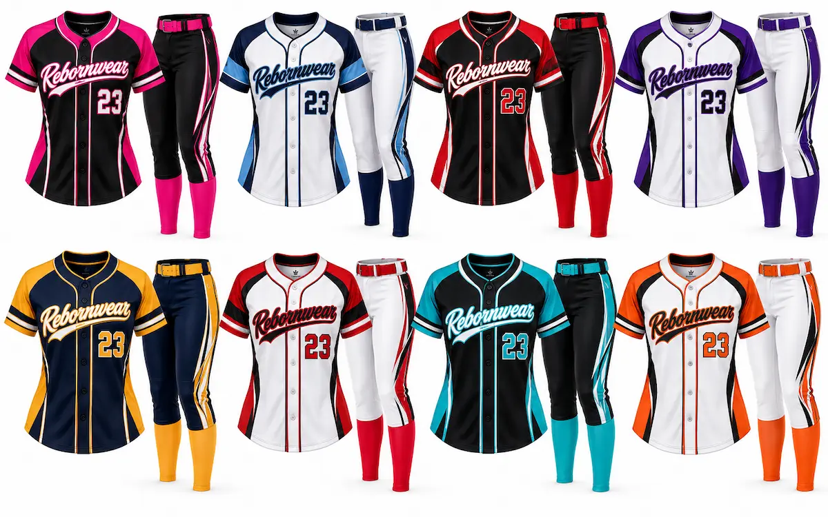
6. Navy & Red with White
The most durable color story in team sports — navy base, red accent, white for numbers and lettering. High contrast keeps the numbers readable from the stands, and it photographs well in any lighting.
Best for: School teams and traditional programs wanting a dependable identity.7. Black & Neon (Volt, Pink, or Orange)
A black base with a single high-energy neon accent. The neon draws the eye on trims and numbers while the black keeps it from looking busy — a modern favorite for fastpitch travel teams wanting an aggressive, current look.
Best for: Competitive travel teams wanting a bold, modern edge.8. Teal & Gray
A softer, less-common pairing that stands out precisely because most teams don’t use it. Teal reads as fresh and distinctive, gray keeps it grounded, and white or black lettering ties it together.
Best for: Newer programs wanting a distinctive, memorable palette.9. Two-Color Split (Home vs. Away)
Rather than one palette, design two coordinated looks — a light-base home set and a dark-base away set sharing the same logo and lettering style. It gives the team a polished, program-level feel and solves visibility against different opponents.
Best for: Established programs ordering full home-and-away sets.Typography & Number Ideas
Direct answer: Numbers and lettering aren’t just decoration — they have to be readable from the stands and the field. The best typography choices balance a team’s personality with plain legibility.
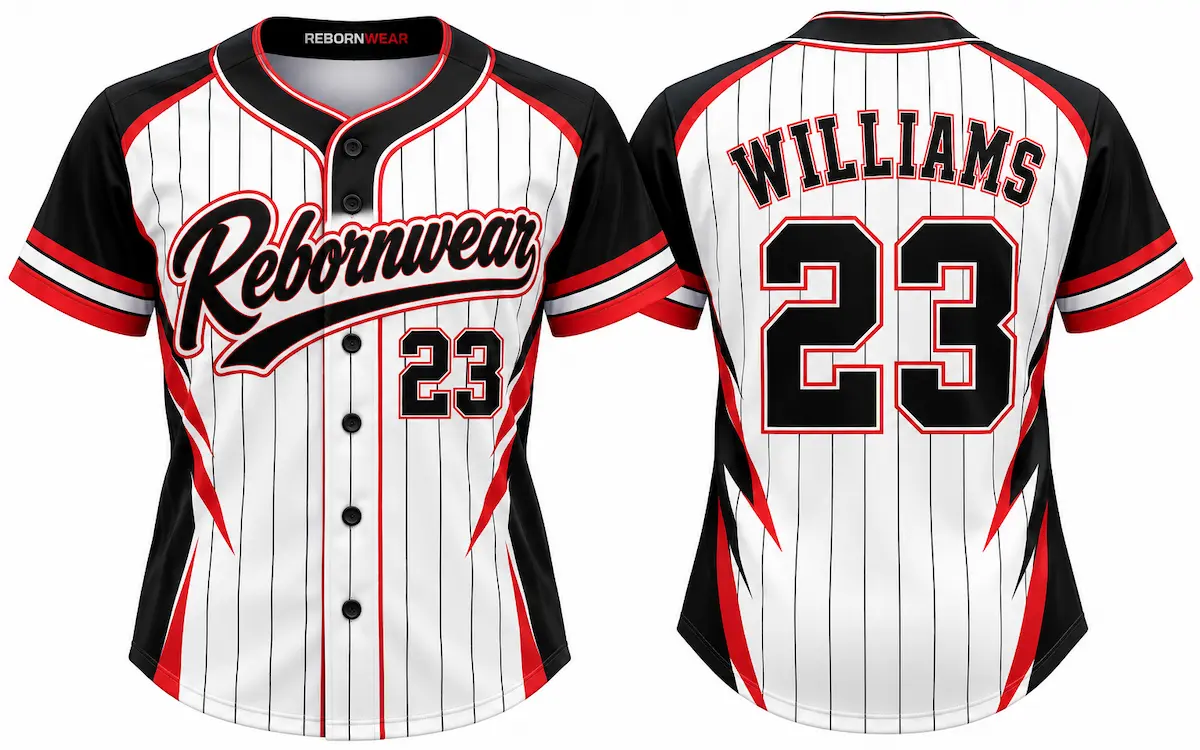
10. Bold Block Numbers with a Contrast Outline
A thick block numeral in one color with a thin outline in a second — the most readable number treatment there is. The outline makes the number pop against the jersey no matter the base color, which is why it’s the standard for competitive play.
Best for: Any team that prioritizes on-field readability.11. Tackle-Twill-Style Lettering
A classic, slightly collegiate look — bold serif or varsity lettering for team names and player names. With sublimation this look is printed rather than stitched, so you get the traditional appearance without the added weight of real twill.
Best for: School and traditional programs wanting a heritage feel.12. Player Name + Number Combos
Adding player names above or below the number turns a uniform into a personalized kit. It’s the detail that makes players feel part of a real program — and with digital customization, adding a full roster of names and numbers is straightforward on a team order.
Best for: Travel and tournament teams wanting a pro-level touch.Format: Youth, Fastpitch & Slowpitch Ideas
Direct answer: The format your team plays shapes what works — youth teams, fastpitch, and slowpitch each have different fit and design priorities worth designing around.
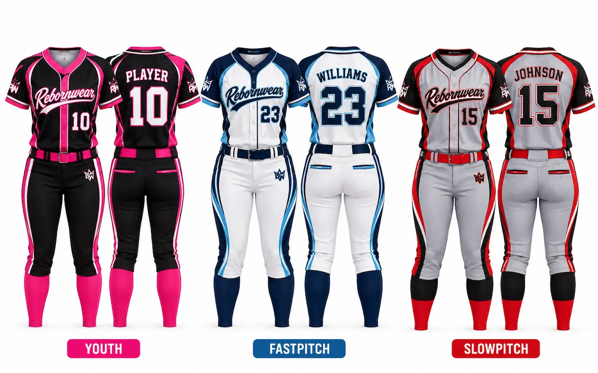
13. Youth: Simple, High-Contrast, Durable
Younger teams do best with a clean, high-contrast design — bold colors, big readable numbers, and a simple style that photographs well for team pictures. Skip fine detail that gets lost at small jersey sizes.
Best for: Little League and youth rec teams.14. Fastpitch: Fitted Cut with Bold Modern Graphics
Fastpitch teams often want a more athletic, fitted look with modern design elements — gradients, sublimated side panels, sharp color-blocking. It’s the format most open to bold, current design directions.
Best for: Competitive fastpitch travel and school teams.15. Slowpitch: Relaxed Fit, Team & Sponsor Branding
Slowpitch and league teams often prioritize comfort and space for sponsor logos or league branding. A relaxed cut with a clean front for a sponsor name is a common, practical direction.
Best for: Adult rec, church, and corporate league teams.Softball Team Color Inspiration Table
Direct answer: If you’re stuck on where to start, these tested color combinations each carry a different personality — pick the one that fits how you want your team to be seen.
| Color Combination | Personality | Best Lettering Color |
|---|---|---|
| Navy & Red | Traditional, dependable | White |
| Black & Neon | Bold, modern, aggressive | White or the neon |
| Teal & Gray | Fresh, distinctive | White or black |
| Royal Blue & Yellow | Classic, high-energy | White |
| Maroon & Gold | Collegiate, premium | White or cream |
| Kelly Green & White | Clean, high-contrast | White with dark outline |
Frequently Asked Questions
What are the most popular softball uniform colors?
Navy and red with white lettering is the most popular and dependable combination, followed by black-and-neon for a modern look and royal blue with yellow for high energy. The best choice is one with strong contrast so numbers stay readable from the stands.
Can any design be printed on a softball uniform?
Nearly any design — gradients, all-over prints, multi-color graphics — can be reproduced with full-dye sublimation, which prints the design into the fabric. Very complex designs are best confirmed with a sample before a full team order.
How do I make my team’s numbers easy to read?
Use bold block numbers with a contrasting outline, and pair a dark jersey with light numbers (or vice versa). Avoid low-contrast pairings like navy numbers on black — they look fine up close but disappear at a distance.
Should youth and adult softball uniforms be designed differently?
Yes — youth uniforms do best with simpler, high-contrast designs and big readable numbers, since fine detail gets lost at small sizes. Fastpitch and adult teams have more room for bold modern graphics and fitted cuts.
Can I get player names added to each uniform?
Yes — adding individual player names alongside numbers is straightforward on a custom team order, and it gives the uniforms a personalized, pro-level feel.
Ready to Bring Your Design to Life?
RebornWear manufactures custom softball uniforms factory-direct from Sialkot, Pakistan, with full sublimation, low minimums, and a free design proof before you commit.
Explore Custom Softball Uniforms